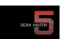
 The credits are placed on a black background surrounded by colourful bright lights which emphasises lights and an exciting mixed atmosphere, a bit like Las Vegas itself. The can also see numbers ranging from 1-11 made out by the luminous dots. The rate at which the number are changing also prepares the audience for a fast exciting film, creating an upbeat atmosphere. The black background which the lights are backed onto could emphasise the danger behind the thrilling life which is going to occur in this film. After the audience have seen the range of numbers, they turn into objects that would be placed in a casino, such as fruit machines and playing cards. This highlights where this film is set and what is going to happen in the film like gambling. The font during the credits are white, which could be so that the audience can read the names due to it being on a black background, or maybe it could be resembling the 'good guys' in the film against a black background which could represent danger. The numbers are in the style of the numbers on an electronic scoreboard and when turned on the move continuously. The colours of the numbers are different, this could highlight that the colours of the numbers compare to the characteristics of the actors in the film. It could also stand for how busy the town (Las Vegas) is. The use of rhythmical music highlights the mood of the film as it is a comedy film and the music is quite happy.
 Tuesday, 11 October 2011
Opening Title Sequence To Oceans 11 By Saul Bass
 The credits are placed on a black background surrounded by colourful bright lights which emphasises lights and an exciting mixed atmosphere, a bit like Las Vegas itself. The can also see numbers ranging from 1-11 made out by the luminous dots. The rate at which the number are changing also prepares the audience for a fast exciting film, creating an upbeat atmosphere. The black background which the lights are backed onto could emphasise the danger behind the thrilling life which is going to occur in this film. After the audience have seen the range of numbers, they turn into objects that would be placed in a casino, such as fruit machines and playing cards. This highlights where this film is set and what is going to happen in the film like gambling. The font during the credits are white, which could be so that the audience can read the names due to it being on a black background, or maybe it could be resembling the 'good guys' in the film against a black background which could represent danger. The numbers are in the style of the numbers on an electronic scoreboard and when turned on the move continuously. The colours of the numbers are different, this could highlight that the colours of the numbers compare to the characteristics of the actors in the film. It could also stand for how busy the town (Las Vegas) is. The use of rhythmical music highlights the mood of the film as it is a comedy film and the music is quite happy.
Subscribe to:
Post Comments (Atom)
No comments:
Post a Comment