Jaws was the opening title sequence I chose because I thought the effects were very good. The editing, sound, camera angles and mise en scene were also very effective.
http://www.scribd.com/doc/72368512
Saturday, 15 October 2011
Friday, 14 October 2011
Opening Title Sequence To The Man With The Golden Arm By Saul Bass
The screen is black with white lines across it which could represent needles or a cut out effect. The lines could also represent bones which gives the audience an image that the film is about arms. The white on black creates a dramatic effect as they are quite dull colours and you always see bad guys wearing black. The film could be about good and bad guys as black is bad and white is usually for purity or for someone good. At the start of the opening sequence the lines are random, but near the end of the opening title sequence the lines make and arm with veins in which could highlight people injecting something into their veins giving the film a slightly scarier atmosphere. The music is very jazzy which contradicts with the dark, scary film.
Thursday, 13 October 2011
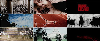
Opening Title Sequence To Dawn Of The Dead By Kyle Cooper

http://www.youtube.com/watch?v=lwBigliX1Bo
The writing is in red which could represent death and blood in the film. The writing is in normal writing but then blood appears to sweep the text away as if someone blowing through a straw. The opening title sequence has given a quick glance to the zombies, which could make the film more thrilling for the audience and they don't know what is going to happen after the opening title sequence. The title 'Dawn Of The Dead' is shown in bold, this emphasises what the film is going to be about. 'Dawn' creates darkness, or waking and 'Dead' indicates suspense and thriller. At the beginning there are pop up images of the scary parts of the film, this may warn the audience what the film is about, but also encourage them to carry on watching it by only revealing a quick flash of a few pictures.
Opening Title Sequence To Bullitt By Pablo Ferro
http://www.youtube.com/watch?feature=player_detailpage&v=S__L_OQe6NE
The film starts of in darkness which makes the audience know that something bad is going to happen. The music that is used it quite loud and tense, which also gives that audience a sense that something is going to happen and increases the tension. The audience get a tour of the rooms and when this is happening the music has got a bit more relaxed. The credits are in white which makes them stand out and gives effect. We see two men staring at each other in a car park which builds up the tension as the audience don't know what is about to happen. The film jumps a lot from one scene to the other so it gets a bit confusing what is going on and it is quite a disjointed opening title sequence. The title sequence does not tell the audience what is going to happen in the film, leaving room for interpretation.
Opening Title Sequence Of The Shining By Stanley Kubrick
The credits that have been used are very simple to make the audience focus on the images and the music. The car in always in focus in the shots but we only get one shot of the car close up. The other shots are extreme long shots, away from the vehicle; this highlights how big the area is. The difference between the tiny car and the huge landscape around it highlights how there may be a sense of danger or isolation. In the first shot we see of the car, the camera is overhead as the car moves along the winding road in the middle of nowhere. This involves the audience. This then produces a view of just the car, forest and a road which makes the car look enclosed like it is trapped. The music is very dramatic which makes the audience feel tension and think that something is about to happen. I learn that the car is driving in the middle of nowhere to a hotel up in the mountains which portrays a sense of isolation.
Wednesday, 12 October 2011
Opening Title Sequence Of Casino Royale By Daniel Kleinman
The opening image is James Bond shooting the audience and the blood running down the screen. This shows the traditional image and the start of the film but also introduces the new James Bond - Daniel Craig. The credits are shown in white to stand out. The music that is being played is loud and energetic which also creates effect but also prepares the audience for an active, energetic film. During the opening title sequence we see images of card suits and guns which relates back to the title 'Casino Royale' as the film is based in a casino. The card suits and guns turn into a casino wheel, which highlights the mix between murder and gambling, both shown a lot in this film. The queen of spades' face changes through the clip to become the girl seen in the film suggesting she is dark and cunning. Craig walks up to the camera to an extreme close up shot so the audience can see his facial expressions.
Opening Title Sequence Of Catch Me If You Can By Olivier Kuntzel and Florence Deygas
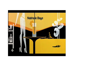
 The music that has been used in the opening title sequence is very important as it creates suspense to combine the action of the film with the images that are going on in the background. To emphasise which character is Leonardo DiCaprio Kuntzel and Deygas decided to use an arrow pointing towards the cartoon character, this could highlight that he may be an important character. As one of the characters is walking up the stairs they disappear maybe so that the person that is following him can't go up them. Also a black line goes up in front of the character following Leonardo DiCaprio which could emphasise how he is being trapped in, but at the end of this line is the title 'Catch Me If You Can.' We then see a taxi driving out of control on the road, maybe that could be the person that has committed the crime and a police car is chasing them. After this we then go to another place where people are swimming and sunbathing - this could show a contrast as to how this film has a bit of action but also some relaxation. The music is also quite relaxed. When something bad is about to happen the music gets faster and the colours get darker, this happens every time something bad is about to happen, so that could be used as a warning for the audience. When the bad guy is not being chased the music becomes calm and relaxed again and the colours change to light colours usually on a black background. The bad guy is wearing black which could represent danger, whereas the police man is wearing white which could mean he is innocent.
 Tuesday, 11 October 2011
Opening Title Sequence To Oceans 11 By Saul Bass
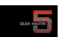
 The credits are placed on a black background surrounded by colourful bright lights which emphasises lights and an exciting mixed atmosphere, a bit like Las Vegas itself. The can also see numbers ranging from 1-11 made out by the luminous dots. The rate at which the number are changing also prepares the audience for a fast exciting film, creating an upbeat atmosphere. The black background which the lights are backed onto could emphasise the danger behind the thrilling life which is going to occur in this film. After the audience have seen the range of numbers, they turn into objects that would be placed in a casino, such as fruit machines and playing cards. This highlights where this film is set and what is going to happen in the film like gambling. The font during the credits are white, which could be so that the audience can read the names due to it being on a black background, or maybe it could be resembling the 'good guys' in the film against a black background which could represent danger. The numbers are in the style of the numbers on an electronic scoreboard and when turned on the move continuously. The colours of the numbers are different, this could highlight that the colours of the numbers compare to the characteristics of the actors in the film. It could also stand for how busy the town (Las Vegas) is. The use of rhythmical music highlights the mood of the film as it is a comedy film and the music is quite happy.
 Monday, 10 October 2011
Opening Title Sequence Of Seven By Kyle Cooper

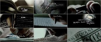
Se7en is a psychological thriller film, which also contains horror and neo-noir elements that makes the film memorable. The director uses close up shots in the whole of the opening scene, maybe so that he doesn't reveal what the character is actually like. By the director choosing to only focus on the arms he is making the audience want to watch the rest of it to find out what the character is really like. We learn that the guy in the film is quite twisted and weird as he is shaving his finger. The film is about the se7en deadly sins gluttony, envy, lust, pride, sloth, greed and wrath. The titles and the directors names are always flashing on and quite jerky which keeps the audience interested and it could represent the characters life and what he is feeling like. The words are always moving which could also represent the movement of his life.
Monday, 3 October 2011
Connotation and Denotation
During this lesson we learnt about what connotation and denotation is. We give labels to things in order to classify them, to make clearer the meaning we are trying to convey.
We also learnt about oppositional and preferred reading.
Oppositional reading is if you make connotations from those which the producer intended you to make.
Preferred reading is if you make connotations that the producer of the media text meant you to make.
Denotation is when you use a name or label the audience has used before. This evokes meaning for the audience. It is the actual process of seeing an object. For example a Christmas tree is a fir tree with balls on.
Connotation is using a name or label the audience has used before. We evoke not only the meaning we intend but also varying range of personal memories of other occasions when the word or label has been encountered. - Memories or thoughts which we inspire by using these labels. It is also words associated with what you see. For example a Christmas tree represents happiness, joy, winter.We also learnt about oppositional and preferred reading.
Oppositional reading is if you make connotations from those which the producer intended you to make.
Preferred reading is if you make connotations that the producer of the media text meant you to make.
What Is A Thriller?
Genre is a method of sorting films based on similarities. There are many genres such as thriller, horror, action, comedy and crime. As well as genres, there are also sub genres which are categories of films amongst a main film genre. The most common sub genres of a thriller are psychological thrillers, crime thrillers and mystery thrillers, but there is also lots more sub genres such as a political thriller, historical thriller, action thrillers and religious thrillers.
There are lots of thrillers released now, all of which create tension and excitement amongst them. Some of these films are:
Sunday, 2 October 2011
Main Coursework Task
The titles and opening of a new fiction film, to last a maximum of two minutes.
All video and audio material must be original, produced by the candidate(s), with the exception of music or audio effects from a copyright-free source. Both preliminary and main tasks may be done individually or as a group. Maximum four members to a group.
Account Of Prelim Shoot
Two days before shooting are prelim task, we were put into groups and we chose what we were going to do are task on. My group decided we wanted to shoot someone being forced to set an alarm off. We chose the different camera angles we were going to use as well as the ones we had to use from the script. We wanted to use a point of view shot as well as the shots we had to use, which were a close up shot, an over the shoulder shot and a wide shot.
Then we filmed it. We started by talking about what we were going to do and if we wanted to get actors in. We decided we wanted to get people in the school to act for us. We then showed them what we needed them to do and gave them the script so they knew what to say. After that we started filming. First we filmed it all as a wide shot, then we filmed it all again as an over the shoulder shot of one of the actors. After filming that shot we filmed the whole scene with a close up. Then we changed sides and filmed the whole of the scene with an over the shoulder shot on the opposite side and then changed to shooting the whole scene as a close up on the same side. After this we did a Point of view shot so that we could get the point of view of each of the guy actor we used. The first time we filmed this it went wrong so we had to film it again and the second time it went better. Then we decided we wanted to film a close up of the girl looking nervous pulling her sleeves up and down, we filmed a close up of the alarm so that people knew what we were doing are scene on and we also did a close up shot of the door handle as the guy opens it. We also wanted to film a shot of one of the characters in focus and the other one blurred in the background but we didn't have time for that.
If we were to do this task again, I think we would have to speed up so that we had time to film everything we wanted.
After filming are prelim task we then got to watch are clips that we had filmed and edit the task. We edited are task on a program called Final Cut Pro, which was quite easy to use once we had been showed how to use it. We started by watching all of our clips through. We had made a mistake when we did one of the filming's, but luckily we had another one filmed so that we could use that. We decided as we didn't have that long to do the editing that we would keep it quite simple. We started by putting in the clip with are names on it, so that the examiner knows who did the film. We then dragged in the clips that we wanted to put in, with a mixture of close up shots, over the shoulder shot and medium close up shots. We had to keep going back to the beginning so that we could check that it all fit in right and flowed the whole time, so that it wasn't jerky.
I think are overall prelim task was ok but if we had more time then it would have been a lot better. The overall task will be better as we will have more time to film it and to edit the clips.
Saturday, 1 October 2011
Subscribe to:
Comments (Atom)


