Monday, 12 December 2011

Cast List

We chose Guy Amos as our photographer or detective because we thought that he would suit the part because he looks quite innocent .

We chose Tom Gass as our messenger because we thought that he looks older than he actually is and we thought that he is quite secretive.


We chose Stephen Paxton as our 'bad guy' because he looks quite scary and we thought he looked suitable to be a bad guy.

We chose Daniella Wild as our 'bad girl' because she looks older than she is but she is still in AS and she does Drama.


We chose Phil as the man looking through the pictures because we didnt actually see who the person was, so we thought he would be a good actor

Tom Gass


Stephen Paxton


Daniella Wild


Sunday, 11 December 2011

Research Work For Thriller Idea

We looked at the bit in Lovely Bones that they shut the curtains and that is how we got our idea as to how we shut the curtains in our opening title sequence. Below is the link to the curtain scene in Lovely Bones:


We also got some of our ideas from Se7en by Kyle Cooper. Below is the link to the opening title sequence to Se7en:


Sunday, 13 November 2011

The Final Decision

Our final decision is going to be set in the 1950s and we our going to film it at Hurtwood House. We are going to start with the photographer meeting a messenger under a lamppost receiving the letter and then we were going to have a person opening a letter and reading it. We are going to cut a man and girl in the bedroom and her hitting him over the head whilst the photographer is taking pictures of this. After this we cut to a man sitting at a desk, using a tracking shot we follow him looking at the pictures and then we see him bring out a gun and leave with the gun. This is when the opening title sequence cuts, leaving the shadow on the wall with a heron in the background. The film is called 'The Shadow Of The Heron.'

The Changes We Made To Get Our Final Decision

We have changed our decision a few times to finally come to the one we want to produce. Our ideas have all been based around the same thing but we have changed reasons for why they are taking photos and the actually presentation of the opening title sequence. We started off by making a story board and coming up with the idea of have a photographer taking a picture of a girl like he is stalking her and then heading back to the developing room and we watch him develop the photos and stick them in a scrap book. We got our ideas for this opening title sequence from the opening title sequence to 'Se7en'. We then presented it to Matt and he said that the idea was good but not to have someone taking pictures of the girl like he was stalking her. We went back to drawing another storyboard. This time we thought that we could have a nature photographer taking photos of trees and long grass and everything. Then something crosses his screen but its really fast so he can't see it. He goes back to his printing room and when the photo is on the screen it looks normal and nothing is wrong with in but when he prints it out we see a girl in the background of every photo, and each sheet that comes out the printer has the girl in but she is getting closer and closer. He realises that she is there lifts up the photo and looks out the window and sees the same girl. Then we thought we didn't really like that, so we eventually came up with our final idea of a detective taking pictures of this man and women in a room and then we see a man looking through these pictures. Then he leaves the room. It took us a long time to come to our final decision, but I hope this opening title sequence will turn out well and look very effective and interesting.

Thursday, 10 November 2011

How Our Group Reached Our Main Thriller Idea

We started by presenting our ideas to each other. My ideas were:
  • A man getting out of a car and walking slowly towards a house. Then the girl is looking through a window at him. We then get a close up of a man from waist down, so we don't know who he is. Then it flicks to a close up of the girls face to show her facial reactions. He opens the door, gets close to her and then it cuts.
  • A girl is walking and someone is following her. When she turns round the person disappears. She carries on walking and then she turns round again and he disappears. This continues for a few more times. Then eventually she gets a tap on her shoulder, she turns round and screams.
  • Someone in a house watching TV. The TV turns off, bells start ringing and then stop, lights flick on and off. She sees that a window is slightly open like someone has just come through it. The items that were on the window sill are now broken on the floor. Muddy footprints on the floor, so she follows them till she gets to some shoes using a tracking shot. As she reaches the shoes she sees something and screams, then it cuts.
  • It is a sunny day and we get a high angle shot of a lake. It zooms in like someone is flying down to the lake. When the camera gets to water level, the camera goes underwater and we see fish and see creatures setting a beautiful, tranquil scene. Then as we swim further down we see bubbles and we follow the bubbles to find out where they are coming from, we keep going to the bottom of the sea and then suddenly we see a dead body at the bottom of the sea.
We then narrowed it down to each of us choosing our best one. I chose:
  • Someone in a house watching TV. The TV turns off, bells start ringing and then stop, lights flick on and off. She sees that a window is slightly open like someone has just come through it. The items that were on the window sill are now broken on the floor. Muddy footprints on the floor, so she follows them till she gets to some shoes using a tracking shot. As she reaches the shoes she sees something and screams, then it cuts.
After doing this we then decided we would narrow it down to our favourite one within the group. We chose Molly's idea which was:
  • Someone taking pictures of a girl, following her around. After taking the pictures he goes back to his house and develops the photo in a developing room. He then sticks them in a scrap book.
We have based our thriller idea on Molly's idea and also on the opening title sequence to se7en but have adapted and changed it.

First Group Meeting

Today, we were split into groups. This was done totally randomly by calling out a number between 1 and 10. I am with Izzy, Molly and Charlotte. I think we are a good group because we all get on well and are organised. We all do equal amounts of work so that we have all contributed to the overall task.

Saturday, 15 October 2011

My Favourite Opening Title Sequence

Jaws was the opening title sequence I chose because I thought the effects were very good. The editing, sound, camera angles and mise en scene were also very effective.

http://www.scribd.com/doc/72368512

Friday, 14 October 2011

Opening Title Sequence To The Man With The Golden Arm By Saul Bass

The Man With The Golden Arm is a 1955 drama film. Saul Bass is also the creator of the opening title sequence. Saul Bass is a graphics designer and film maker, but he is well know for his opening title sequences to films such as: The Man With The Golden Arm, Oceans 11, West Side Story, Big and many more.


The screen is black with white lines across it which could represent needles or a cut out effect. The lines could also represent bones which gives the audience an image that the film is about arms. The white on black creates a dramatic effect as they are quite dull colours and you always see bad guys wearing black. The film could be about good and bad guys as black is bad and white is usually for purity or for someone good. At the start of the opening sequence the lines are random, but near the end of the opening title sequence the lines make and arm with veins in which could highlight people injecting something into their veins giving the film a slightly scarier atmosphere. The music is very jazzy which contradicts with the dark, scary film.

Thursday, 13 October 2011

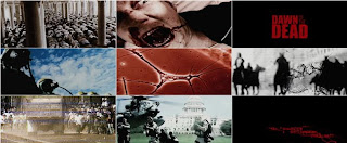
Opening Title Sequence To Dawn Of The Dead By Kyle Cooper

Dawn of the Dead is a 2004 horror film directed by Zack Snyder. Kyle Cooper made the opening title sequence. He is a modern designer of motion pictures. He studied graphics design at Yale university and he worked at an advertising agency in his early years with offices in New York and Los Angeles. 


http://www.youtube.com/watch?v=lwBigliX1Bo


 The writing is in red which could represent death and blood in the film. The writing is in normal writing but then  blood appears to sweep the text away as if someone blowing through a straw. The opening title sequence has given a quick glance to the zombies, which could make the film more thrilling for the audience and they don't know what is going to happen after the opening title sequence. The title 'Dawn Of The Dead' is shown in bold, this emphasises what the film is going to be about. 'Dawn' creates darkness, or waking and 'Dead' indicates suspense and thriller. At the beginning there are pop up images of the scary parts of the film, this may warn the audience what the film is about, but also encourage them to carry on watching it by only revealing a quick flash of a few pictures.


Opening Title Sequence To Bullitt By Pablo Ferro

Pablo Ferro is a graphics designer and a film titles designer. Bullitt is a 1968 American police procedural film directed by peter Yates. 


http://www.youtube.com/watch?feature=player_detailpage&v=S__L_OQe6NE


The film starts of in darkness which makes the audience know that something bad is going to happen. The music that is used it quite loud and tense, which also gives that audience a sense that something is going to happen and increases the tension. The audience get a tour of the rooms and when this is happening the music has got a bit more relaxed. The credits are in white which makes them stand out and gives effect. We see two men staring at each other in a car park which builds up the tension as the audience don't know what is about to happen. The film jumps a lot from one scene to the other so it gets a bit confusing what is going on and it is quite a disjointed opening title sequence. The title sequence does not tell the audience what is going to happen in the film, leaving room for interpretation.

Opening Title Sequence Of The Shining By Stanley Kubrick

Stanley Kubrick first became an inspired filmer when he got given a camera for his 13th Birthday and at the age of 17 he was offered a job as an apprentice photographer. Kubrick planned to move into the film, and in 1950 he spent all his savings making a documentary.   All of Kubrick's films from the mid-1950s onward, except The Shining, were nominated for Oscars, Golden Globes, or BAFTAs.The Shining is a 1980 psychological horror film produced and directed by Stanley Kubrick.


The credits that have been used are very simple to make the audience focus on the images and the music. The car in always in focus in the shots but we only get one shot of the car close up. The other shots are extreme long shots, away from the vehicle; this highlights how big the area is. The difference between the tiny car and the huge landscape around it highlights how there may be a sense of danger or isolation. In the first shot we see of the car, the camera is overhead as the car moves along the winding road in the middle of nowhere. This involves the audience. This then produces a view of just the car, forest and a road which makes the car look enclosed like it is trapped. The music is very dramatic which makes the audience feel tension and think that something is about to happen. I learn that the car is driving in the middle of nowhere to a hotel up in the mountains which portrays a sense of isolation. 

Wednesday, 12 October 2011

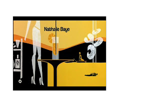
Opening Title Sequence Of Casino Royale By Daniel Kleinman

Daniel Kleinman is a British Television Commercial and Music video director, but also designed the opening title sequence to the James Bond films. I used Art Of The Title to show the creativity of the opening title sequence.


The opening image is James Bond shooting the audience and the blood running down the screen. This shows the traditional image and the start of the film but also introduces the new James Bond - Daniel Craig. The credits are shown in white to stand out. The music that is being played is loud and energetic which also creates effect but also prepares the audience for an active, energetic film. During the opening title sequence we see images of card suits and guns which relates back to the title 'Casino Royale' as the film is based in a casino. The card suits and guns turn into a casino wheel, which highlights the mix between murder and gambling, both shown a lot in this film. The queen of spades' face changes through the clip to become the girl seen in the film suggesting she is dark and cunning. Craig walks up to the camera to an extreme close up shot so the audience can see his facial expressions. 

Opening Title Sequence Of Catch Me If You Can By Olivier Kuntzel and Florence Deygas

Kuntzel and Deygas are a duo of visual artists who  live and work in Paris. Deygas graduated from Gobelins L’Ecole de L’image, studying film animation. Catch Me If You Can has a Saul Bass influence in the title which many people talk about. To create Leonardo DiCaprio's character they chose to not use high levels of technology but imagine the characters in stamp form. I used Art Of The Title to see the step by step break down of the opening title sequence and creativity that went in to it.


The music that has been used in the opening title sequence is very important as it creates suspense to combine the action of the film with the images that are going on in the background. To emphasise which character is Leonardo DiCaprio Kuntzel and Deygas decided to use an arrow pointing towards the cartoon character, this could highlight that he may be an important character. As one of the characters is walking up the stairs they disappear maybe so that the person that is following him can't go up them. Also a black line goes up in front of the character following Leonardo DiCaprio which could emphasise how he is being trapped in, but at the end of this line is the title 'Catch Me If You Can.' We then see a taxi driving out of control on the road, maybe that could be the person that has committed the crime and a police car is chasing them. After this we then go to another place where people are swimming and sunbathing - this could show a contrast as to how this film has a bit of action but also some relaxation. The music is also quite relaxed. When something bad is about to happen the music gets faster and the colours get darker, this happens every time something bad is about to happen, so that could be used as a warning for the audience. When the bad guy is not being chased the music becomes calm and relaxed again and the colours change to light colours usually on a black background. The bad guy is wearing black which could represent danger, whereas the police man is wearing white which could mean he is innocent.  

Tuesday, 11 October 2011

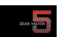
Opening Title Sequence To Oceans 11 By Saul Bass

Saul Bass was a graphic designer and film maker, but he was best a animated style opening sequences. During his time helping Otto Preminger to design the film poster for the film Carmen Jones, he was also asked to create the opening title sequence to this same film. This made Saul Bass think and he first saw his opportunity to create something better than an opening title sequence that would enhance the audience's mood for the theme of the film within the few seconds of the film.


The credits are placed on a black background surrounded by colourful bright lights which emphasises lights and an exciting mixed atmosphere, a bit like Las Vegas itself. The can also see numbers ranging from 1-11 made out by the luminous dots. The rate at which the number are changing also prepares the audience for a fast exciting film, creating an upbeat atmosphere. The black background which the lights are backed onto could emphasise the danger behind the thrilling life which is going to occur in this film. After the audience have seen the range of numbers, they turn into objects that would be placed in a casino, such as fruit machines and playing cards. This highlights where this film is set and what is going to happen in the film like gambling. The font during the credits are white, which could be so that the audience can read the names due to it being on a black background, or maybe it could be resembling the 'good guys' in the film against a black background which could represent danger. The numbers are in the style of the numbers on an electronic scoreboard and when turned on the move continuously. The colours of the numbers are different, this could highlight that the colours of the numbers compare to the characteristics of the actors in the film. It could also stand for how busy the town (Las Vegas) is. The use of rhythmical music highlights the mood of the film as it is a comedy film and the music is quite happy. 

Monday, 10 October 2011

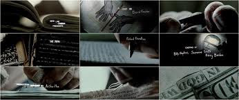
Opening Title Sequence Of Seven By Kyle Cooper

Kyle Cooper is a modern designer of motion picture title sequences and he studied graphic design at Yale university. He got his inspiration from Saul Bass, and follows in Saul Bass's foot prints. Kyle Cooper is an award winning, modern film maker who specialises in the production of opening titles, and has produced and directed over 100 different title sequences in his lifetime so far. He wrote many films such as Spider Man, Se7en, Iron Man, Sherlock Holmes and lots more.  Cooper worked at an advertising agency with offices in New York and Los Angeles. During this period, he created the title sequence for the 1995 film Se7en. I looked at the website Art Of The Title which breaks down films into snippets of the opening title scene to highlight the creativity and design put into it. 


Se7en is a psychological thriller film, which also contains horror and neo-noir elements that makes the film memorable. The director uses close up shots in the whole of the opening scene, maybe so that he doesn't reveal what the character is actually like. By the director choosing to only focus on the arms he is making the audience want to watch the rest of it to find out what the character is really like. We learn that the guy in the film is quite twisted and weird as he is shaving his finger. The film is about the se7en deadly sins gluttony, envy, lust, pride, sloth, greed and wrath. The titles and the directors names are always flashing on and quite jerky which keeps the audience interested and it could represent the characters life and what he is feeling like. The words are always moving which could also represent the movement of his life.

Monday, 3 October 2011

Connotation and Denotation

During this lesson we learnt about what connotation and denotation is. We give labels to things in order to classify them, to make clearer the meaning we are trying to convey.


Denotation is when you use a name or label the audience has used before. This evokes meaning for the audience. It is the actual process of seeing an object. For example a Christmas tree is a fir tree with balls on.
Connotation is using a name or label the audience has used before. We evoke not only the meaning we intend but also varying range of personal memories of other occasions when the word or label has been encountered. - Memories or thoughts which we inspire by using these labels. It is also words associated with what you see. For example a Christmas tree represents happiness, joy, winter.

We also learnt about oppositional and preferred reading.

Oppositional reading is if you make connotations from those which the producer intended you to make.
Preferred reading is if you make connotations that the producer of the media text meant you to make.

What Is A Thriller?

A thriller is a genre that uses suspense, tension and excitement as its main elements. They create anxiety, surprise and anticipation amongst the audience watching the film. The aim of a thriller is to keep the audience interested and on the edge of their seat.

Genre is a method of sorting films based on similarities. There are many genres such as thriller, horror, action, comedy and crime. As well as genres, there are also sub genres which are categories of films amongst a main film genre. The most common sub genres of a thriller are psychological thrillers, crime thrillers and mystery thrillers, but there is also lots more sub genres such as a political thriller, historical thriller, action thrillers and religious thrillers.


There are lots of thrillers released now, all of which create tension and excitement amongst them. Some of these films are:


Sunday, 2 October 2011

Main Coursework Task

The titles and opening of a new fiction film, to last a maximum of two minutes.

All video and audio material must be original, produced by the candidate(s), with the exception of music or audio effects from a copyright-free source. Both preliminary and main tasks may be done individually or as a group. Maximum four members to a group.

Prelim Video

Below is our prelim video:


Account Of Prelim Shoot

Two days before shooting are prelim task, we were put into groups and we chose what we were going to do are task on. My group decided we wanted to shoot someone being forced to set an alarm off. We chose the different camera angles we were going to use as well as the ones we had to use from the script. We wanted to use a point of view shot as well as the shots we had to use, which were a close up shot, an over the shoulder shot and a wide shot.


Then we filmed it. We started by talking about what we were going to do and if we wanted to get actors in. We decided we wanted to get people in the school to act for us. We then showed them what we needed them to do and gave them the script so they knew what to say. After that we started filming. First we filmed it all as a wide shot, then we filmed it all again as an over the shoulder shot of one of the actors. After filming that shot we filmed the whole scene with a close up. Then we changed sides and filmed the whole of the scene with an over the shoulder shot on the opposite side and then changed to shooting the whole scene as a close up on the same side. After this we did a Point of view shot so that we could get the point of view of each of the guy actor we used. The first time we filmed this it went wrong so we had to film it again and the second time it went better. Then we decided we wanted to film a close up of the girl looking nervous pulling her sleeves up and down, we filmed a close up of the alarm so that people knew what we were doing are scene on and we also did a close up shot of the door handle as the guy opens it. We also wanted to film a shot of one of the characters in focus and the other one blurred in the background but we didn't have time for that.


If we were to do this task again, I think we would have to speed up so that we had time to film everything we wanted.


After filming are prelim task we then got to watch are clips that we had filmed and edit the task. We edited are task on a program called Final Cut Pro, which was quite easy to use once we had been showed how to use it. We started by watching all of our clips through. We had made a mistake when we did one of the filming's, but luckily we had another one filmed so that we could use that. We decided as we didn't have that long to do the editing that we would keep it quite simple. We started by putting in the clip with are names on it, so that the examiner knows who did the film. We then dragged in the clips that we wanted to put in, with a mixture of close up shots, over the shoulder shot and medium close up shots. We had to keep going back to the beginning so that we could check that it all fit in right and flowed the whole time, so that it wasn't jerky. 

I think are overall prelim task was ok but if we had more time then it would have been a lot better. The overall task will be better as we will have more time to film it and to edit the clips.


Saturday, 1 October 2011

Prelim Story Boards

Here are the story boards we used to film our prelim media task:


Friday, 30 September 2011

Prelim Coursework Task

Continuity task involving filming and editing a character opening a door, crossing a room and sitting down in a chair opposite another character, with whom she/he then exchanges a couple of lines of dialogue.

This task should demonstrate match on action, shot/reverse shot and the 180-degree rule.

Thursday, 29 September 2011

Camera Angles

During this lesson we learnt about the different camera angles. We learnt about:
Big Close Up shot highlight emotion and the detail on the face.

A Mid shot is used to provide information on the body language and clothes of the character.
Wide shot is used to set a scene, make clear the physical geography of the space and sets up the atmosphere.
A Point Of View shot provides a perspective from a particular characters point of view; the director is manipulating whose eyes the audience experiences the story from.

A Close Up shot reveals a characters personality, it is useful for dramatic scenes or if a character is revealing moments of truth or crisis.

An Over The Shoulder shot helps to create a dynamic between the character and what they are seeing. It can also be used to suggest that someone is being followed or watched by an unseen person.

A High Angle shot can indicate low status or vulnerability.

 Low Angle shot indicates high status – someone powerful or intimidating.

A Long shot can be used to distance the audience from events or suggest loneliness or isolation.


After learning about the different camera angles we watched the opening scene of the film ‘Pleasantville’ about 5 times and analysed the different camera angles that were used. An establishing shot (Wide shot) was used at the start to present a day – school campus to highlight that the school could be anywhere such as California. Then there is a Medium Close Up of David which shows him isolated against a blurred background, which could tell the audience that he is an outsider. There was a high angle shot to show isolation and loneliness. We then get a close up of the girl and it looks like he is talking to her and she is laughing with him. But in fact as we get a long shot we see that she is talking to a friend and David is imagining this conversation. 

Friday, 23 September 2011

Camera – Lesson 2

Our second camera lesson was a test on what we had learnt the week before. We had to put up the camera in groups remembering what we had already learnt. We then learnt about the 180 degree rule. 
Then we got a chance to film a scene in groups. We chose to film someone picking up a book from different angles. We started by filming from a wide shot to get everything in the shot, then we filmed a close up of her picking up the book, and then we filmed from the sides. Matt and Guy then showed them to us and told us about how we could cut clips from the different angles to make the scene better.
 
The 180 degree rule means that two characters should always have the same left and right relationship to each other. When the camera crosses the line connecting the two subjects together it is called 'crossing the line.'


This picture shows the axis between two characters and the 180 degree arc where cameras will be positioned on the green side. When cutting from the green side to the red side, the characters switch places on the screen.

Camera – Lesson 1

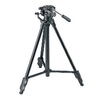
During my first lesson, our media teachers Matt and Guy taught us how to put the camera and tripod stand together like bubbling the tripod, how to put the camera on the tripod stand, how to put the battery in and lots more. Then we had a chance to put the camera together in groups. Then we learnt what some of the buttons on the camera do, such as white balance where you have to look at a white wall through the camera and click white balance to get a normal looking shot, exposure, zooming and focus where you zoom in on an object and check that it is in focus and not blurry. After that we looked on the screen and Matt and Guy told us what some of the images on the screen were. We had a battery and some numbers which meant how long the battery has left, and we learnt about time coding including number of frames per second, seconds, minutes and hours. We learnt about the exposure – that 50 was the normal amount of exposure that you needed.


Introduction

Hi, my name is Victoria Cooper, I am 17 and I go to Hurtwood House. I am studying Media Studies, Business Studies, Geography and Accountancy. I chose Media Studies because I wanted a ‘fun’ subject and it seemed really interesting, so far I am enjoying it. I enjoy filming and editing clips, but I don’t really like acting. I am hoping Media will help to build up my self confidence and by the end of the course I will be able to edit films to a higher standard and know how to use a professional camera. I am looking forward to the point that we start filming clips, but I am worried that I might have to act or that if I do the filming that I will miss a clip. My interests are cooking, hockey, animals, books and seeing friends. My favourite film is the ‘Inbetweeners Movie’.